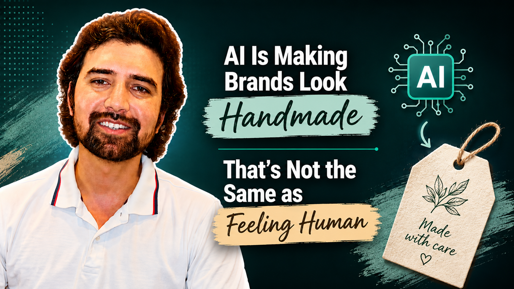
You’ve seen it, even if you haven’t named it.
Hand-drawn lettering on a packaged food brand. Paper grain layered over a stock photo. Wobbly, slightly off-centre type on a new café’s signage. Retro illustration on a cleaning product that has never been anywhere near a workshop. Logos that look a bit unfinished on purpose.
Fast Company ran a piece on this in August 2026 arguing that the trend has tipped into something forced. The writer, John Pobojewski, is a design director, and his complaint is not that hand-drawn work is bad. It’s that the look is being applied to brands where it doesn’t mean anything, as a reflex rather than a decision.
He points at Panera Bread’s polished swash typography, which gestures at hand-painted grocery signage while the brand is known for consistent, mass-produced food. He points at ultra-luxury hospitality brands using hand-drawn elements that sit awkwardly against very polished properties. He also points at Claude, the AI assistant, which uses hand-drawn illustration to signal that it’s the more human option.
Around the same time, Nielsen Norman Group published research reaching a partly different conclusion. Their analysis found that handmade visuals have become a genuine trust signal, and that audiences are responding to them for real reasons.
Both things are true, and the gap between them is where the useful answer sits. Some brands are getting real value from this. Others are buying a texture pack. What separates them isn’t the aesthetic. It’s whether there’s anything behind it.
Why This Is Happening
The explanation is fairly simple. Polish used to cost something.
Producing a flawless image took a photographer, a retoucher, a budget and a few weeks. Because it was expensive, polish worked as a rough signal of quality. If a brand looked immaculate, it had probably invested in looking immaculate, which suggested it invested in other things too.
That relationship has broken. Anyone can generate a smooth, professional-looking visual in under a minute. When perfection becomes free, it stops indicating anything about the company behind it.
So the signal moves. Audiences start looking for evidence that a person was involved and cared enough to do the work. Uneven line weights, visible brushstrokes, shapes that don’t quite close, handwritten type, texture that isn’t perfectly flat. Nielsen Norman describes these as the marks of intention and attention.
There’s also a fatigue element. People are buying vinyl records, using film cameras and choosing slower things generally. The handmade look sits in the same emotional territory.
This is a pendulum the design industry has swung before. Skeuomorphism, the style that made early smartphone apps look like leather notebooks and felt-lined poker tables, made sense as a bridge between physical objects and touchscreens, then spread into places where it served no purpose. Grunge typography in the late nineties borrowed the energy of photocopied zines and ended up on corporate brochures. Each started as a response to something real and became a default.
What Separates the Ones That Work
Here’s the pattern I noticed reading across both pieces, and I think it’s the whole thing.
In every example that works, there is a named human being and a story you can check.
Hermès redesigned its homepage in 2026 by commissioning French illustrator Linda Merad to produce twelve hand-drawn illustrations inspired by linocut and lithographic printing. The brand credited her by name across its promotion. That fits, because Hermès has commissioned named artists for its silk scarves since 1937. The style expresses something the company already was.
The Paris 2024 Olympics commissioned illustrator Ugo Gattoni for its official posters, breaking from the usual approach of athlete photography. The organisers didn’t just publish the artwork. They published the process, including that Gattoni worked close to 2,000 hours across six months and drew entirely by hand, using digital tools only to scan and refine.
Acne Studios, a brand built on cool Scandinavian minimalism, ran a campaign using illustrator Michael McGregor’s hand-drawn work on Instagram. It didn’t replace their identity. It sat alongside their usual desaturated photography, adding warmth in one place rather than everywhere.
Fast Company’s own positive example follows the same rule. A bakery called Rose worked with Super Studio, which used the bread itself to print with, producing a marbled texture that was literally made by the product. The texture wasn’t a reference to craft. It was the output of the craft.
Now compare that to a brand that buys a hand-lettered font and a scanned paper texture from a stock library and applies them to existing packaging. Nobody made anything. There’s no author, no process, no story. The look is a claim about care with nothing supporting it.
| Works | Falls flat |
|---|---|
| A named illustrator you can look up | A hand-lettered font bought from a library |
| A documented process, hours, materials | A texture layered over existing artwork |
| Craft the brand already had | Craft the brand is gesturing at |
| Applied where it fits the business | Applied because it is the current style |
The difference is not visible in the artwork. It’s visible in whether the brand can answer a simple question: who made this, and what did it take?
The Part That Should Worry Anyone Considering This
Here’s the complication that makes the whole trend unstable.
AI can now produce work that looks hand-drawn.
Nielsen Norman makes this point directly. With the right prompting, a tool could approximate the linocut style, the wobbly line, the brushstroke, the paper grain. The imperfection itself is reproducible.
Which means the aesthetic is losing its power as a signal at roughly the same speed as it’s becoming popular. If a rough texture reliably meant a person made it, that would be worth something. It doesn’t reliably mean that any more, and audiences will work that out.
What can’t be reproduced is the part around the artwork. A named illustrator with a body of work. A documented process. Two thousand hours. A bakery that printed with its own bread. The story is the evidence, and the story is the thing a prompt can’t generate.
So if you’re planning to adopt this look, the useful question isn’t which texture to use. It’s whether you have anything true to attach to it. If you do, lead with that and let the visuals follow. If you don’t, the visuals are decoration and fairly fragile decoration at that.
The Trap Nobody Mentions
There’s a second problem, and Fast Company puts it well. This aesthetic has become so widespread that using it now means blending in.
That’s an odd outcome for a design choice made in the name of standing out. Brand identity exists to create separation in a market. If every new bakery, every wellness brand and every consultancy is reaching for the same slightly imperfect look, the look stops distinguishing anyone. You’ve adopted the visual language of a category rather than of your own business.
I’d extend that a little further for the kind of businesses I usually work with. If you’re a small operation competing against larger ones, looking like a generic version of the current trend is a genuine cost. Your actual advantage is usually that you’re specific: a particular person, particular experience, particular way of doing things. A borrowed aesthetic covers that up rather than communicating it.
The Ethical Line
Nielsen Norman raises something worth repeating, because it applies well beyond design.
A lot of AI and robotics companies have adopted warm colours, soft illustrations and hand-drawn elements. The reasoning is understandable. Those signals read as approachable, and approachability makes people more willing to try an unfamiliar product.
The problem arrives when the warmth is doing work the product can’t support. If a brand looks welcoming and trustworthy while the underlying tool is unreliable, insecure or inaccurate, people end up feeling misled. Warmth used as a cover damages trust more than plain, honest coldness would have.
That’s the same principle underneath a lot of marketing questions. The visual can set an expectation, but it can’t fulfil one. If there’s a gap between what your branding promises and what your customer experiences, the branding has made the problem worse rather than better.
What I’d Actually Do
Here’s how I’d approach this if you’re a business owner or an independent professional wondering whether to lean into it.
Start with what’s already true
Before choosing any visual direction, work out what’s actually distinctive about how you operate. Not aspirational values. Concrete things.
Do you make something by hand? Does one person do all the work? Do you use a material or a method most competitors don’t? Has your family run this for two generations? Do you do the thing yourself that your larger competitors outsource?
Whatever’s on that list is what your identity should be expressing. If handmade elements express it, they’ll work. If they don’t, they’ll read as costume.
Show the process rather than referencing it
This is the practical version of the Hermès and Paris examples, scaled down to a business that isn’t Hermès.
Instead of buying an artisanal-looking texture, photograph your actual workspace. Instead of a handwriting font, use your actual handwriting. Instead of a retro illustration suggesting craft, show the person doing the work, with their name.
For a lot of small businesses this is cheaper than the alternative and considerably more convincing. A real photograph of a real workshop, badly lit, beats a generated illustration of an imagined one.
If you commission, credit
If you do bring in an illustrator or a photographer, name them and talk about the collaboration. That’s what turns the artwork into evidence rather than decoration. It also tends to be the honest thing to do, and the illustrator will share the work with their own audience, which you get for free.
Try it in one place first
Nielsen Norman’s practical advice is sensible. You don’t need to commit to a full rebrand. Test the direction in one campaign, one page or a run of social posts, the way Acne Studios did. If your audience responds, extend it. If it feels like fancy dress, you’ve lost very little.
Make the words match
A handmade visual language paired with corporate boilerplate copy produces an odd effect. If you’re signalling that real people are behind the business, the writing has to sound like a person too. Visual warmth and stiff writing cancel each other out.
Use AI properly if you’re using it
Fast Company’s advice here is worth repeating, because most people get it wrong in the same way. The common mistake is treating the first output as the answer.
The useful approach is closer to directing. Go back and forth, be specific about what’s wrong, refine, explore the accidents that turn up along the way. The work gets more intentional through iteration, not through a good first prompt. The same is true of briefing a human designer, which is probably the point.
What This Comes Down To
The instinct behind this trend is right. Audiences are tired, sceptical, and looking for evidence that a person is involved. Responding to that is sensible.
The mistake is thinking the response is visual. Looking handmade is a claim about how something was made. Claims need backing, and in a period when the look itself is easy to manufacture, the backing is the only part that carries weight.
If you have a real story about how your business works, tell it, and let the design express it. That will hold up whether or not this particular aesthetic is still fashionable in three years, because it isn’t really about the aesthetic.
If you don’t have that story yet, the more valuable project is finding it rather than choosing a font.
Frequently Asked Questions
Is the handmade design trend worth following?
It depends entirely on whether it expresses something true about your business. Nielsen Norman’s research found handmade visuals genuinely function as a trust signal, and the brands cited as successful all had real craft or real authorship behind the look. Fast Company’s criticism is aimed at brands applying the style where it contradicts what they actually are. Same aesthetic, opposite outcomes.
Won’t AI-generated imperfect design work just as well?
Visually it might come close, and that’s precisely the problem. If the look is easy to generate, the look stops proving anything. What holds value is the verifiable part: a named illustrator, a documented process, a real material. That’s the piece a prompt can’t produce.
I’m a small business without budget for a custom illustrator. What can I do?
Photograph your actual work and workspace. Use your own handwriting. Show the person doing the job, by name. This is usually cheaper than commissioning a stylised look and more persuasive, because it’s evidence rather than reference.
Does adopting this style make my brand look dated later?
Possibly, if you adopt it as a style. Trends cycle, and this one has precedents in skeuomorphism and nineties grunge typography, both of which overshot and then receded. Design rooted in something specific about your business tends to age better than design rooted in what’s currently popular.
Should I do a full rebrand around this?
I wouldn’t, at least not as a first step. Test it in one campaign or one section of your site. Acne Studios used illustration on Instagram while keeping its established photography everywhere else, which is a low-risk way to find out whether it fits.
Is there a downside to looking friendlier than we are?
Yes, and it’s the sharpest warning in the research. When visual warmth promises qualities the product can’t deliver, people feel misled, and that damages trust more than a neutral presentation would have. The design should reflect the experience someone will actually have.
Does this apply to service businesses, or just products?
It applies to services too, arguably more. For a consultant, lawyer, architect or clinic, the person is the product. Showing real faces, real work and real process does the same job that craft signals do for a physical product.
If You’re Weighing This Up
Deciding whether a visual direction fits your business is harder than it sounds, mostly because it requires being honest about what your business actually is before deciding how it should look.
That’s usually the part worth spending time on. What’s genuinely different about how you work, which of those things a customer would care about, and how to express it without either overclaiming or hiding it under a style borrowed from somewhere else.
It’s the same question underneath most of the work I do with clients on content and brand presence: finding the specific, true thing and building outward from it rather than starting with what everyone else is doing.
If you’re looking at your own branding and not sure whether it’s saying anything particular about you, that’s a reasonable thing to get a second opinion on.
Click here and tell me what you’re working on
Happy to look at what you have and tell you plainly whether it’s working.
This article is for informational purposes only.
Deepak Vankar is a digital marketing consultant working with businesses and professionals on SEO, content, performance marketing and brand strategy.
Leave a Reply